You just bought a thousand-dollar camera, grabbed an expensive lens, and eagerly went out to shoot. But when you load those RAW files onto your computer, you cry out in despair because the photos look flat, gray, and lifeless. Don't sell your gear just yet! What you lack isn't equipment, but rather Color Grading.
So what the heck is Color Grading, and why does everyone claim it can transform any photo into a masterpiece? Let's uncover the truth and learn how to pull off that Cinematic look in Lightroom right below!
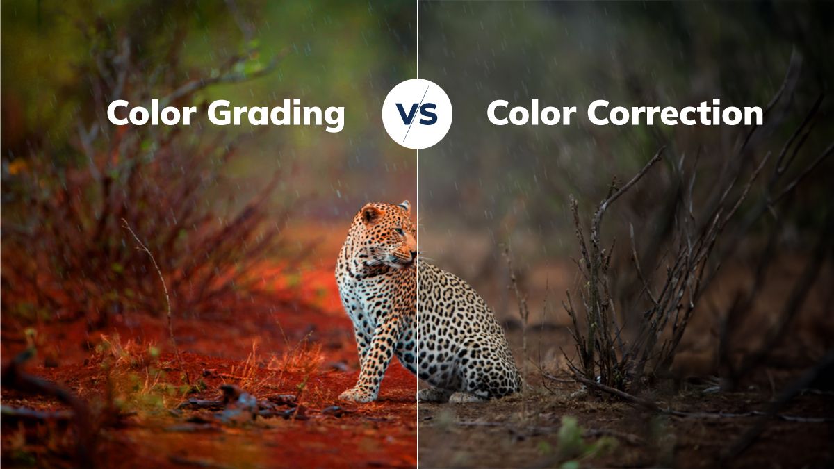
Don't Confuse Color Correction with Color Grading!
Color Grading vs Correction(CLICK TO EXPAND)
EDITORIAL ARCHIVE // SOURCE: INTERNET ARCHIVE
Many beginners think that tweaking the exposure and adjusting White Balance is the whole process. Wrong! That is merely "washing your face." To make it as easy to understand as possible, look at this simple comparison table:
1. Purpose
- Color Correction: Bringing the photo to its most realistic state, true to the naked eye.
- Color Grading: Creating emotion, atmosphere, and a unique style (mood & tone).
2. Main Actions
- Color Correction: White balance, exposure adjustment, noise reduction, lens correction.
- Color Grading: Tinting Shadows/Highlights, Split Toning, adding Grain.
3. Everyday Example
- Color Correction: Washing your face, applying sunscreen, concealing acne.
- Color Grading: Putting on eyeshadow, red lipstick, and sharp eyeliner for a party.
Bottom line: You must get your Color Correction right before you attempt Color Grading. Don't try to apply expensive makeup to an unwashed face!
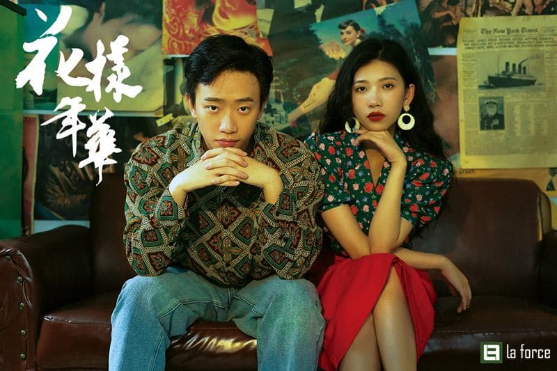
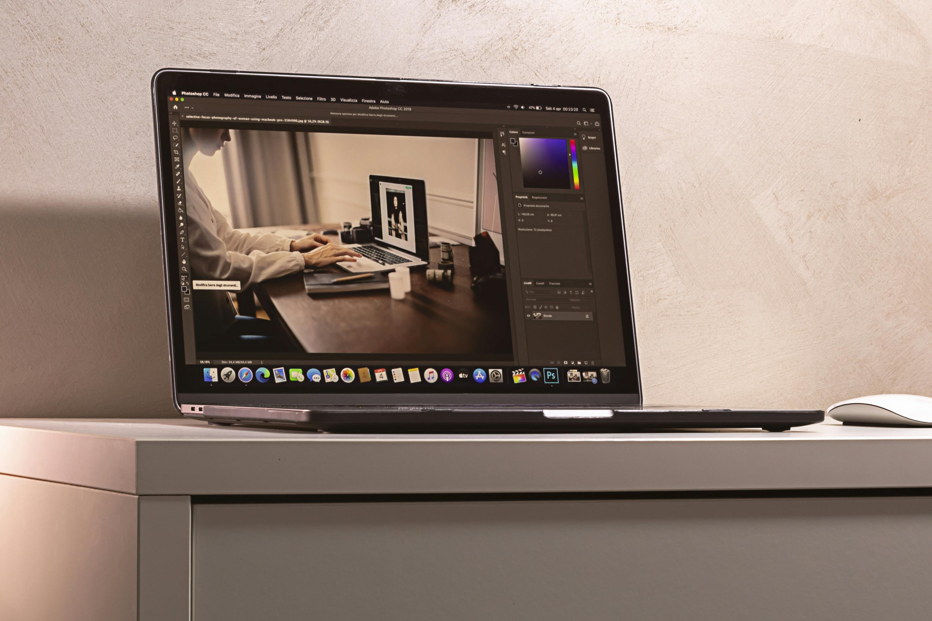
Portrait editing(CLICK TO EXPAND)
EDITORIAL ARCHIVE // SOURCE: PEXELS
Taking a stroll through photography groups on Facebook or Reddit (r/Lightroom, r/postprocessing), it's not hard to encounter complaints and rants about the so-called "Cinematic look":
- "I saw Influencer A selling a $20 Cinematic Preset pack, eagerly bought it, and applied it to a cafe portrait. The result? The model's skin turned sickly orange, and the leaves looked like plastic blue wrap. Waste of money!" — @tuan_nhay_nhot (Facebook Group)
- "People are overusing Teal & Orange! Scroll through Instagram, and 9 out of 10 photos have muted mint skies and glowing orange faces. It looks fake and cheap, not cinematic!" — u/RawShooter99 (Reddit)
- "The secret to cinematic colors isn't in the HSL sliders, guys; it's in the Lighting when you shoot. If you shoot at high noon with flat, harsh light and expect a Cyberpunk film look, you're expecting magic!" — @HuyBui_DOP (YouTube Comment)
Key Insight: Buying instant noodles-style presets is a scam if you don't understand the fundamentals. A true Cinematic look requires a combination of lighting during the shoot and Color Theory skills in post-production.
Cinematic tone(CLICK TO EXPAND)
EDITORIAL ARCHIVE // SOURCE: PEXELS
How to Edit Cinematic Photos in Lightroom (Say No to "Instant Presets")
Lightroom sliders GIF(CLICK TO EXPAND)
EDITORIAL ARCHIVE // SOURCE: INTERNET ARCHIVE
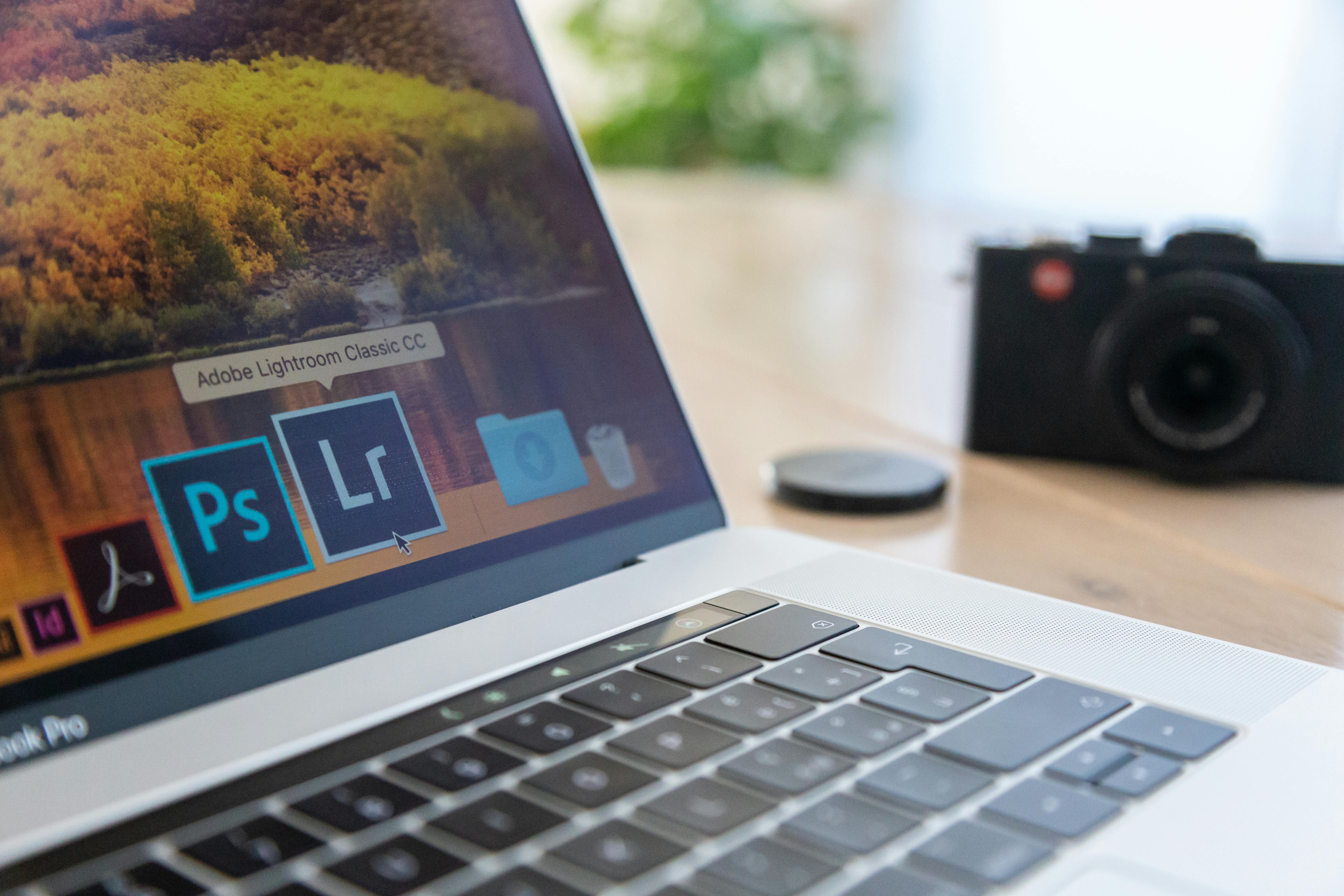
To achieve a true cinematic look, we will go through 4 core steps. Fire up Lightroom Classic or Lightroom CC and practice along!
Step 1: Prep the "Ingredients" (Basic Tab)
This is the mandatory Color Correction step.
- White Balance: Cinematic aesthetics often favor warm (yellow/orange) or cool (cyan/green) tones. Nudge the Temp slider slightly toward the vibe you want.
- Contrast: Lower Highlights (to recover bright details) and raise Shadows (to reveal dark areas). Then, slightly decrease the overall Contrast to make the image look "flatter", setting the stage for aggressive color manipulation.
White balance adjustments(CLICK TO EXPAND)
EDITORIAL ARCHIVE // SOURCE: INTERNET ARCHIVE
Step 2: Shape the Soul with Tone Curve
Don't be afraid of this graph! The S-Curve is the "true love" of film emulators.
- Anchor Points: Create 3 points on the curve (Highlights, Midtones, Shadows).
- Lift the Bottom (Faded Shadows): Grab the bottom-left point and pull it slightly upwards. This turns pure black areas into a hazy dark gray—a hallmark of retro/cinematic film colors.
- Drop the Peak (Muted Highlights): Pull the top-right point down a tiny bit so the harsh highlights are softened and not glaring.
Tone curve settings(CLICK TO EXPAND)
EDITORIAL ARCHIVE // SOURCE: INTERNET ARCHIVE
Step 3: Squeeze the Colors with Color Mixer (HSL) & Color Grading
This is where the magic happens. We'll create the classic Hollywood Teal & Orange tone.
- Color Mixer Tab (HSL):
- Hue: Shift the Blue slider towards Aqua (Cyan). Shift the Green slider towards a faded yellow.
- Saturation: Decrease the Saturation of irrelevant "trash" colors (like Purple, Magenta) to focus the image on two main tones.
- Luminance: Slightly increase the luminance of Orange to make human skin tones pop against the background.
- Color Grading Tab (Color Wheels):
- Shadows: Click the center of the wheel and pull it towards Teal/Blue.
- Highlights: Pull the center towards a warm Orange/Yellow.
- Pro Tip: Remember to tweak the Blending and Balance sliders so the two colors mix smoothly without clashing.
Color grading wheels(CLICK TO EXPAND)
EDITORIAL ARCHIVE // SOURCE: INTERNET ARCHIVE
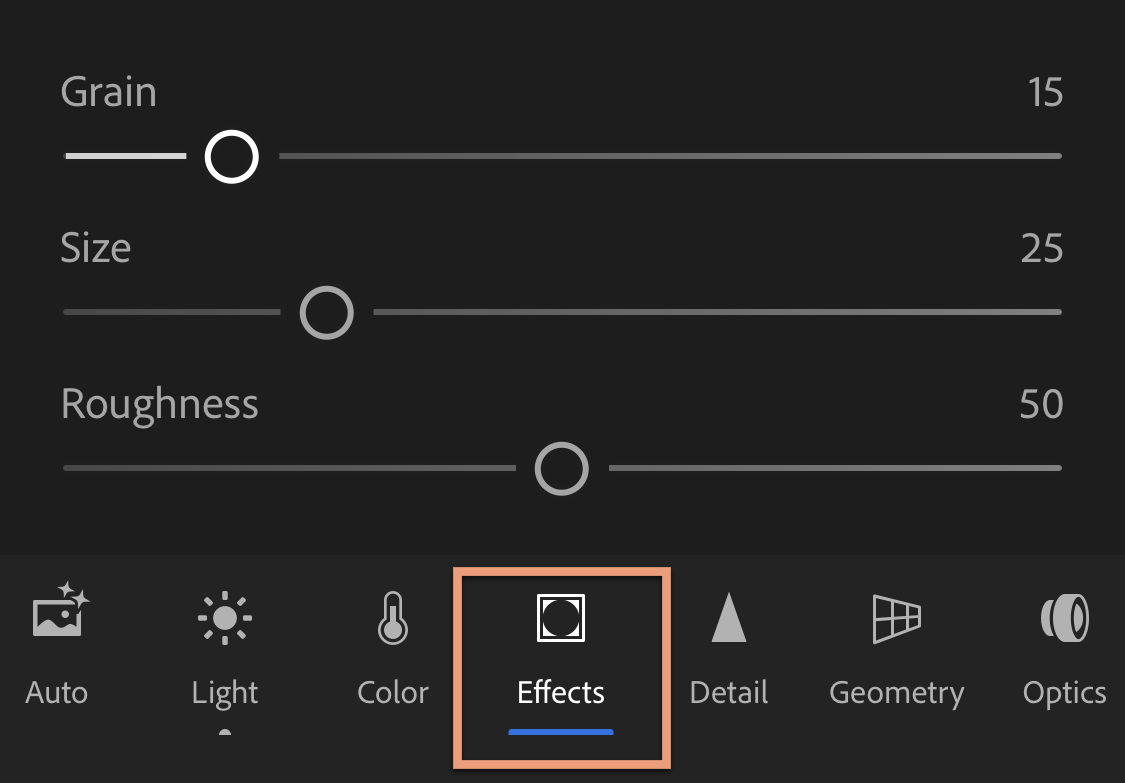
Step 4: Add "Spices" (Effects)
Cinema isn't squeaky clean like product photography.
- Grain: Add about 15-30% Grain to give the photo natural, nostalgic noise, just like shooting on analog film.
- Vignette: Pull the Amount slider to a negative value (-10 to -20) to gently darken the four corners, drawing the viewer's eyes straight to the subject in the center.
Effects panel(CLICK TO EXPAND)
EDITORIAL ARCHIVE // SOURCE: INTERNET ARCHIVE
Conclusion
Color Grading isn't a magic trick you pull off with a single 1-click Preset. It requires an understanding of light, color, and the emotion you want to convey. Don't blindly follow trendy color tones if they don't fit the context of your photo. Master the theory, practice with the sliders every day, and soon you'll create a "Cinematic" look that carries your own signature style.
Now, open Lightroom and go save those gray photos!